Qlik - Rethink the first time experience
Project completedProblem
We have received a SUS score of 55.42 while testing our first time user experience.
- Provide a much better first time experience for our users
- Increase our SUS score to at least 68
Proposal
Based on the user testing and other customer feedback, we need a way to get our users from the main landing page to creating their first visualization as quickly as possible. Through the data that we have collected we can easily see that after a user creates their first visualization, they are more likely to login again in the future and continue their trail experience. Once they have created a few charts and possibly invited a few people, users are very likely to purchase a subscription.
- UX designer focused on getting the user from their initial login experience and moving them to another area of our product where the magic happens.
- I worked with another designer who focused on the latter half of the project. We met frequently to make sure that our two pieces of this project had a consistent feel.
- The other designer and I also worked with a project manager who was able to get all of the assets that we needed to pull the whole thing together.
Design process
Understand the feedback. The first thing that we did was sit down with our user testing team and get a good understanding of the results of this test. Our user testing team was able to provide us with the recorded videos so that we could get a really good understanding of the issues that people were running into.
Collect the data. We combed through the data that we had collected to see where people were dropping off and used it to determine the point at which the user keeps using our product. We were able to figure out that if the user is able to create a chart during their first time using the product that they are likely to return and likely to purchase a subscription. This became our goal: make it easy for our first time users to create a chart.
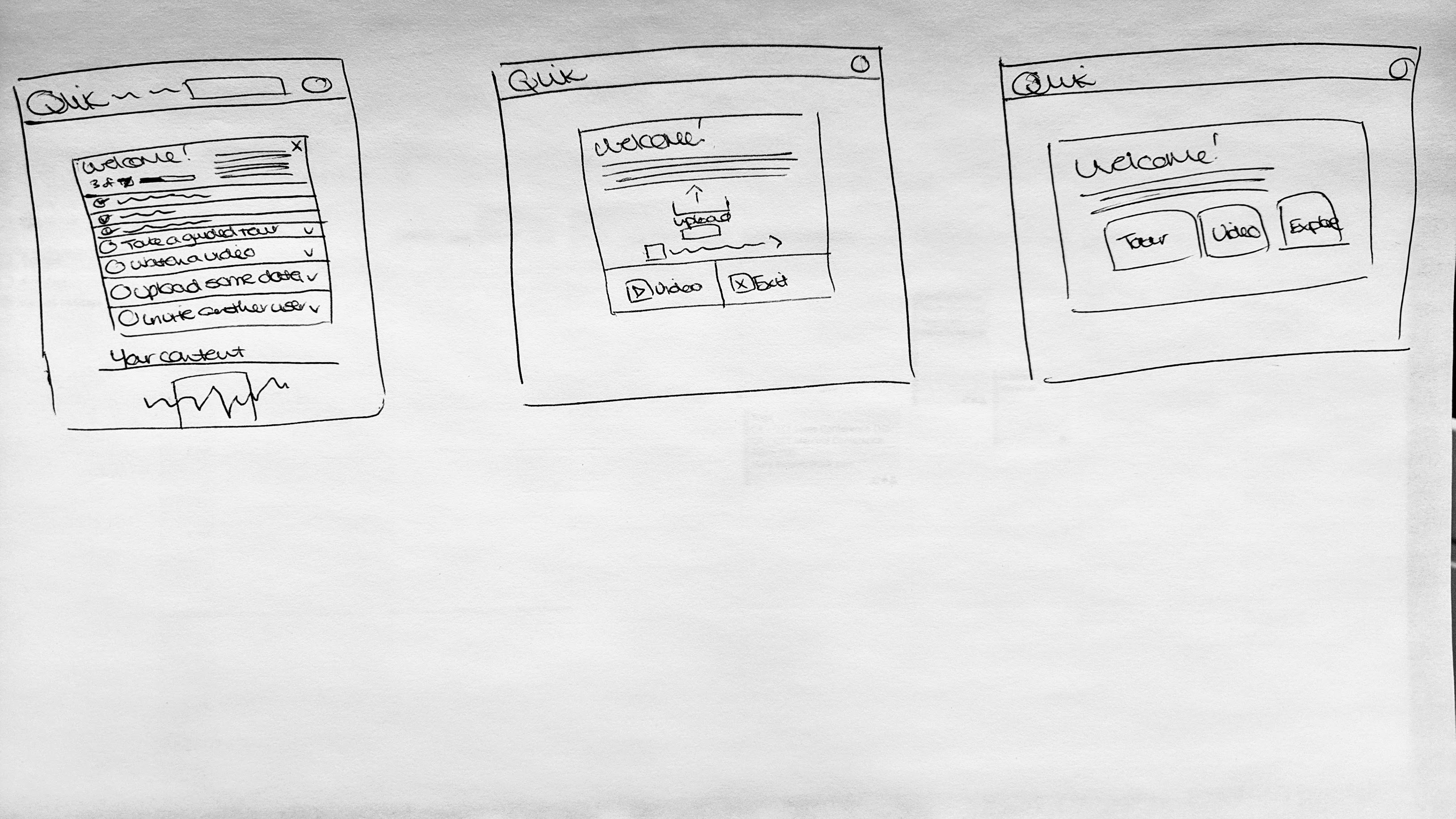
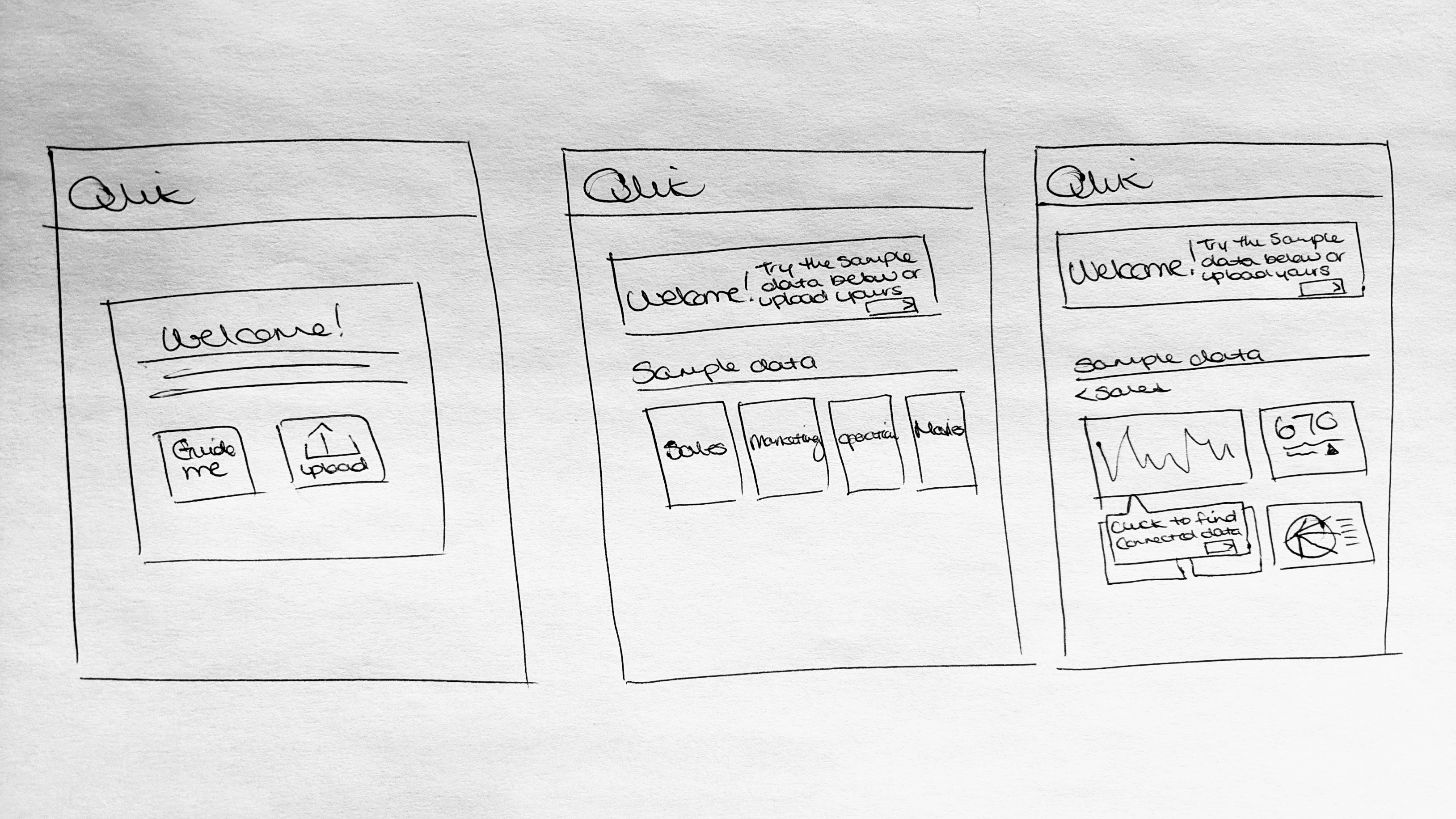
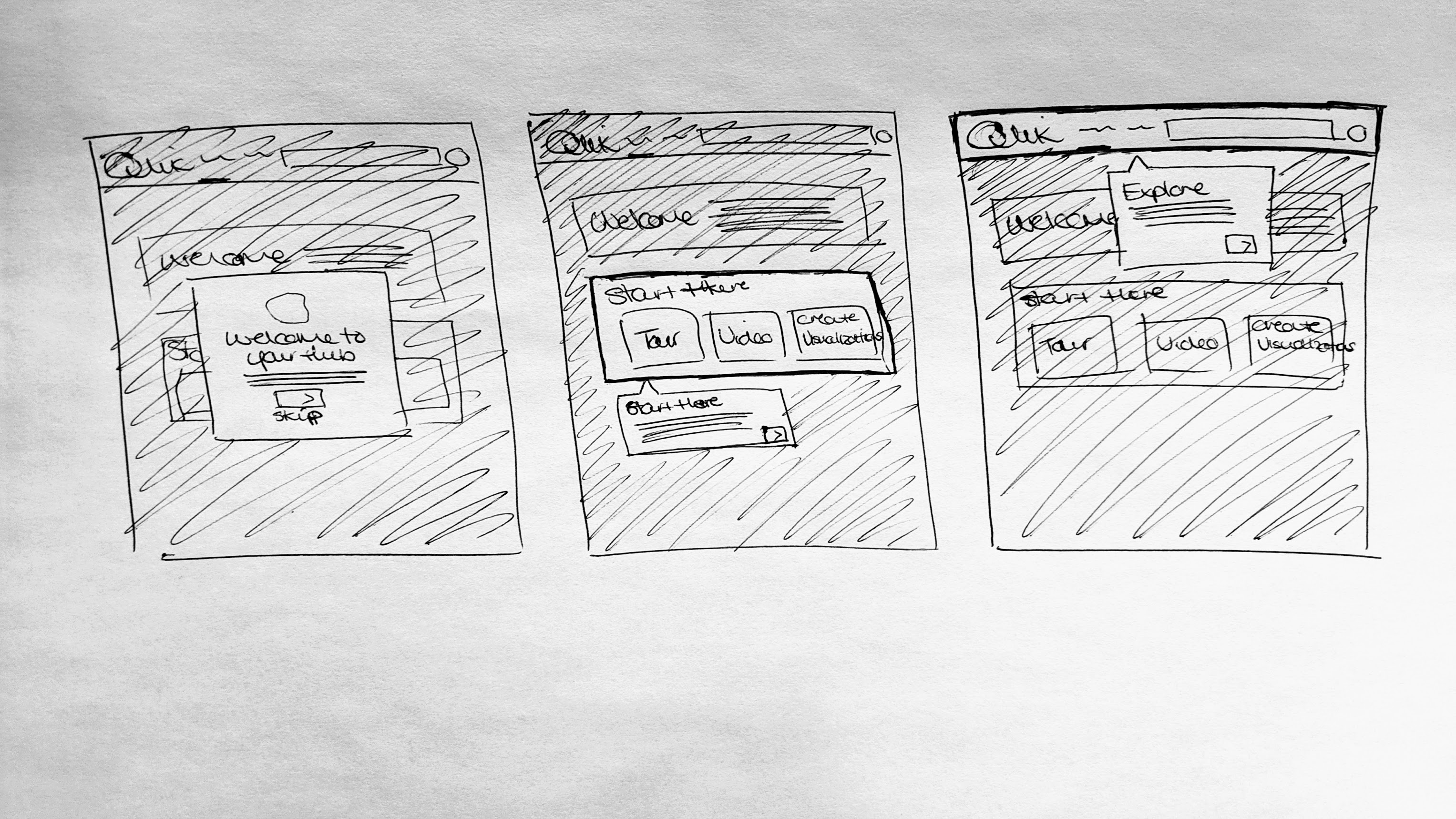
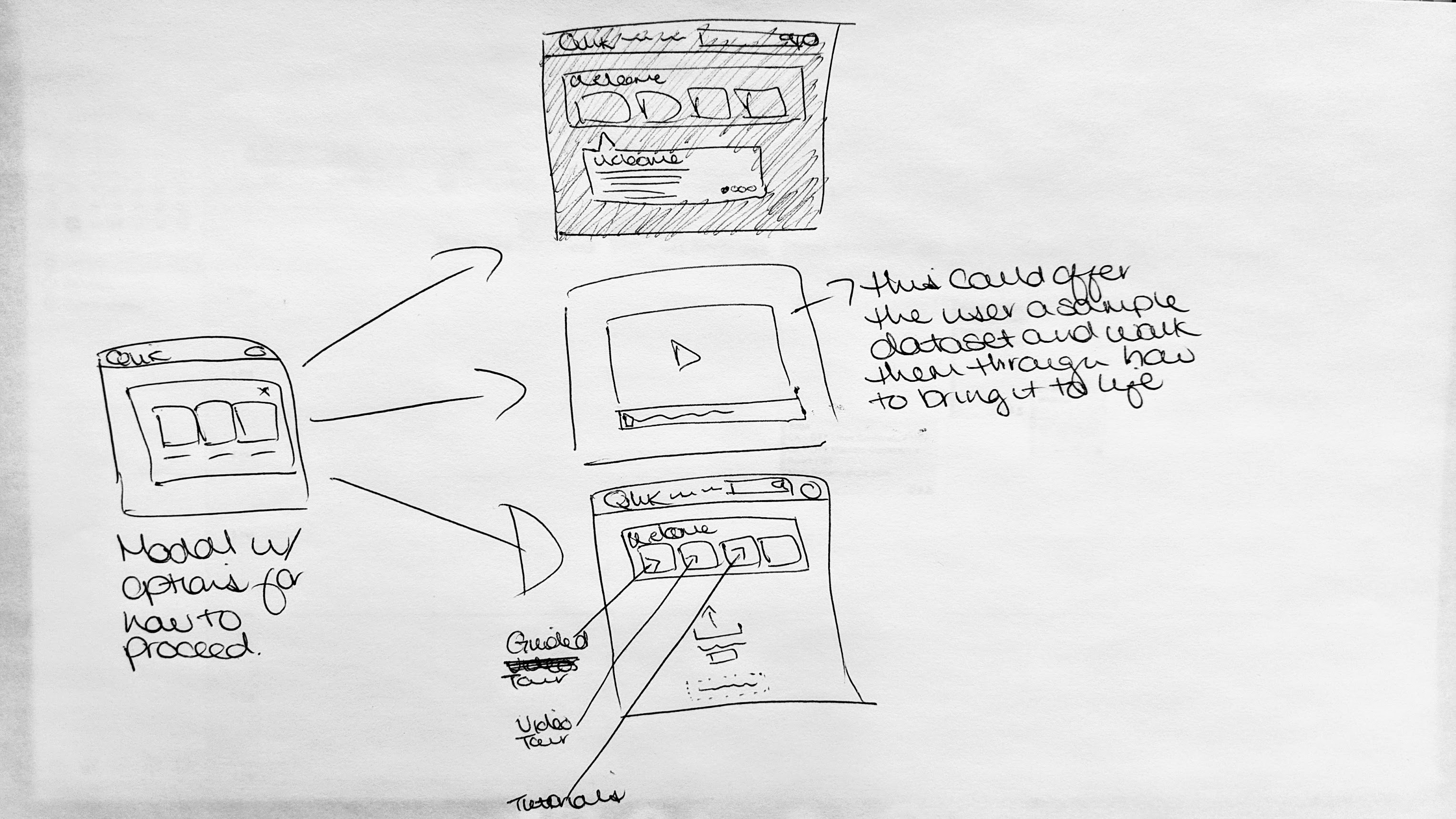
Brainstorm. We started looking at a variety of different onboarding experiences to get some inspiration. I started sketching some ideas out on paper and we setup daily standups to touchbase and review the sketches. Each day I would take that feedback and continue sketching until we had something that we could create within the timeframe we had given ourselves.
Ideate! We had a few sketches in mind with a definite direction to go in. I started making polished versions in Sketch. This is where we started as a team looking at all the different possible user flows to make sure that we had covered all of our bases.
Let's test it again Using my Sketch files my design partner created an Invision prototype that we were able to use to test a different set of users to see how their experience went.
Final concepts
The feedback from our user tests was amazing. Users loved the new experience. We were able to confidently take that news to our development team and get them started on making this a reality. I worked closely with them, answering any questions that they had and providing occasional CSS suggestions so that we could make sure the final version was as close to the Sketch files as possible.
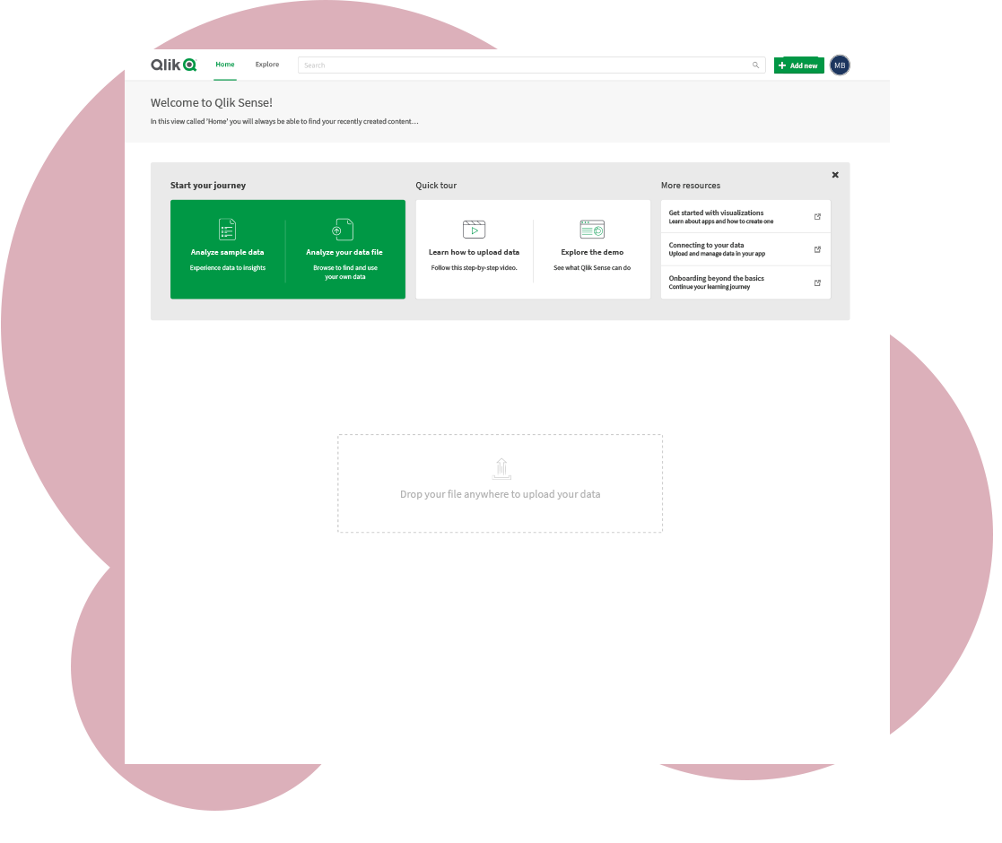
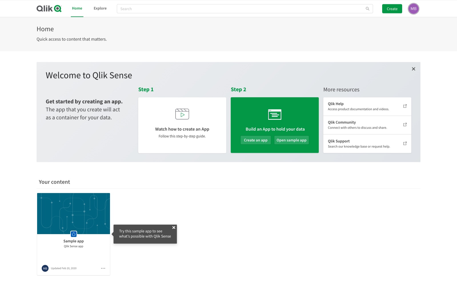
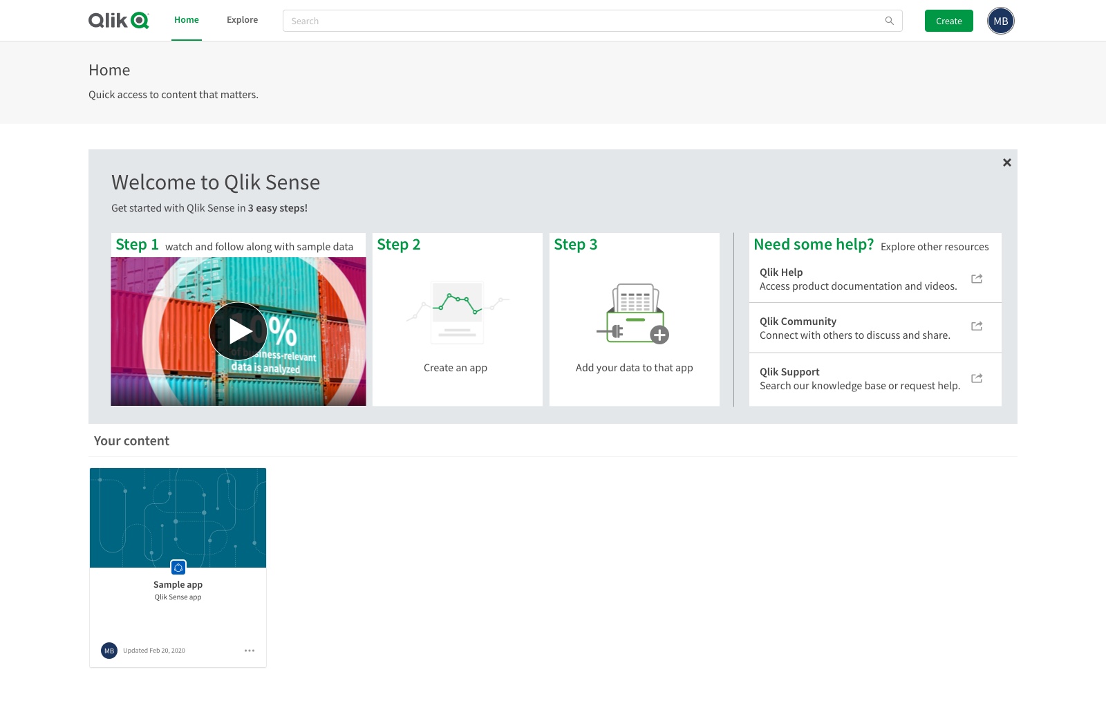
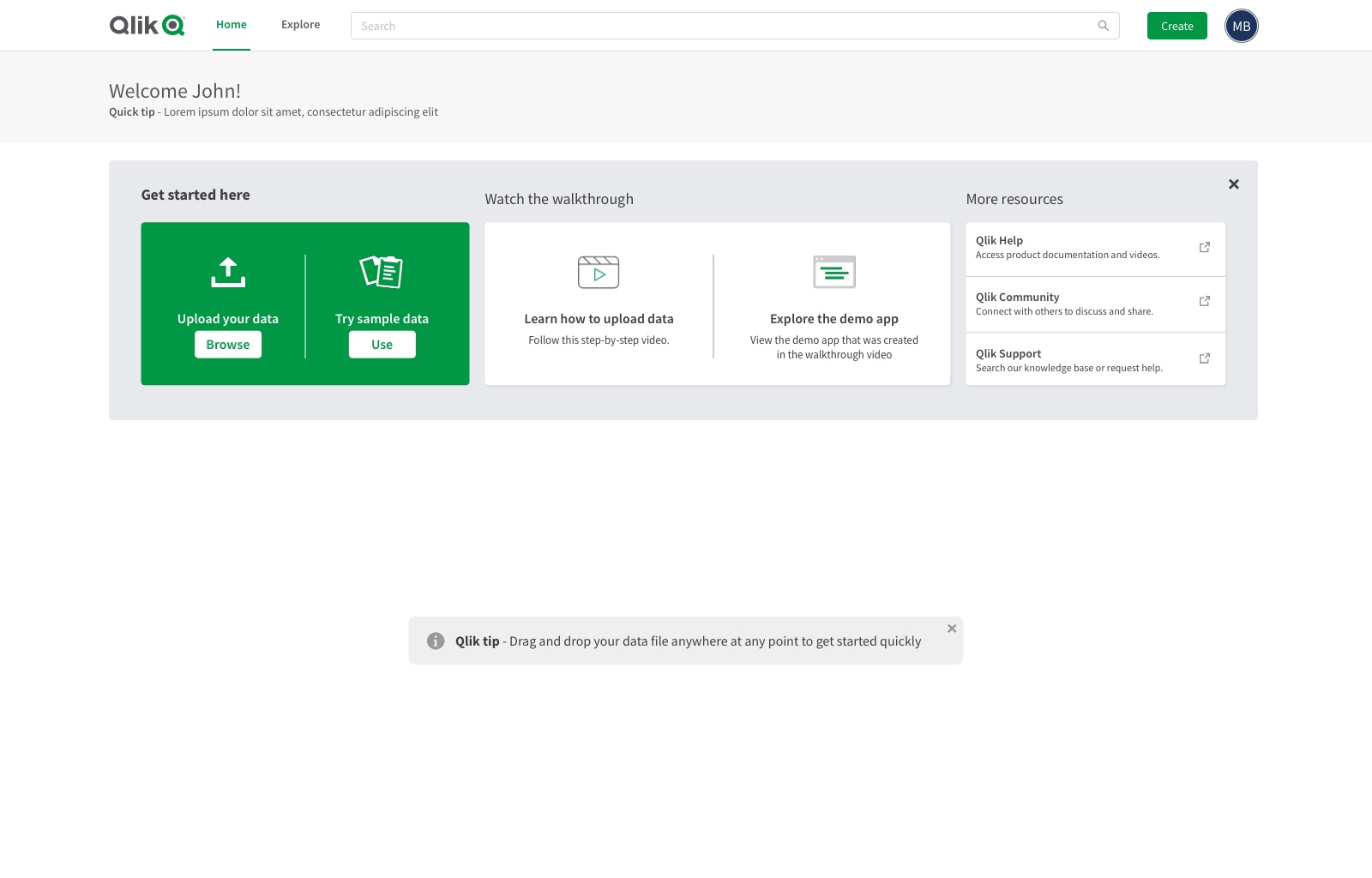
We focused our area of improvement on our welcome banner. We decided to include two ways to quickly get started creating visualizations. The first was using sample data that we provided and the second allowed you to upload your own data. We included a new video for those users who didn't want to jump directly into creating charts and wanted to learn more first. We also provided our users with an example that had charts already created so that users could see what was possible. Lastly, we updated our resource links based on user feedback.
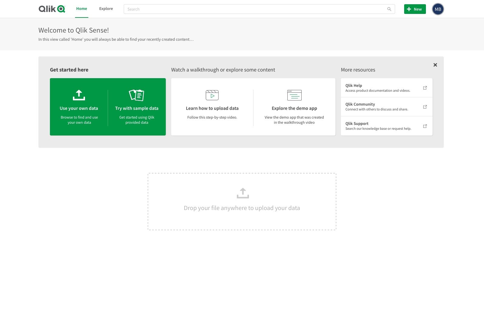
Before
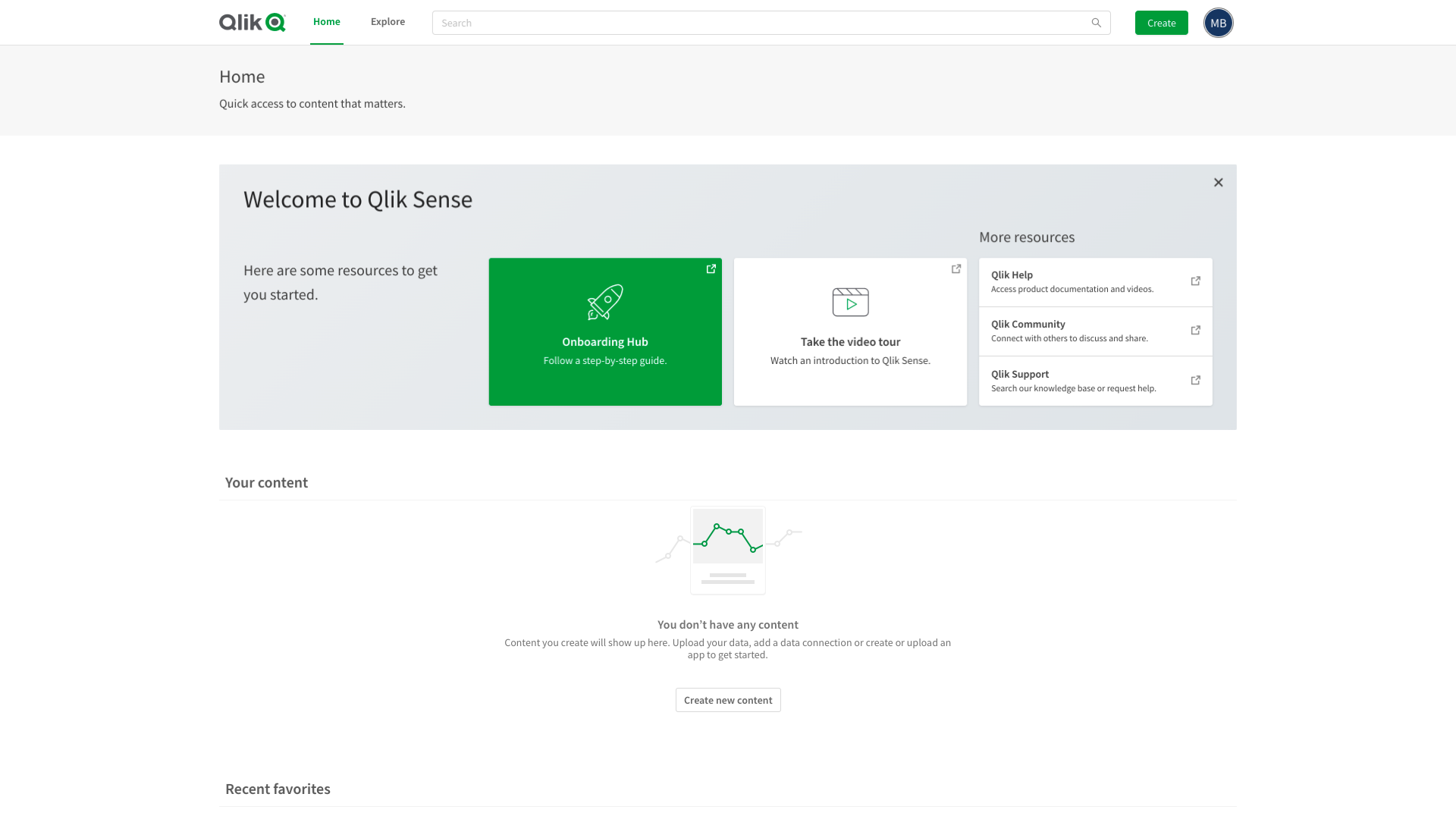
After
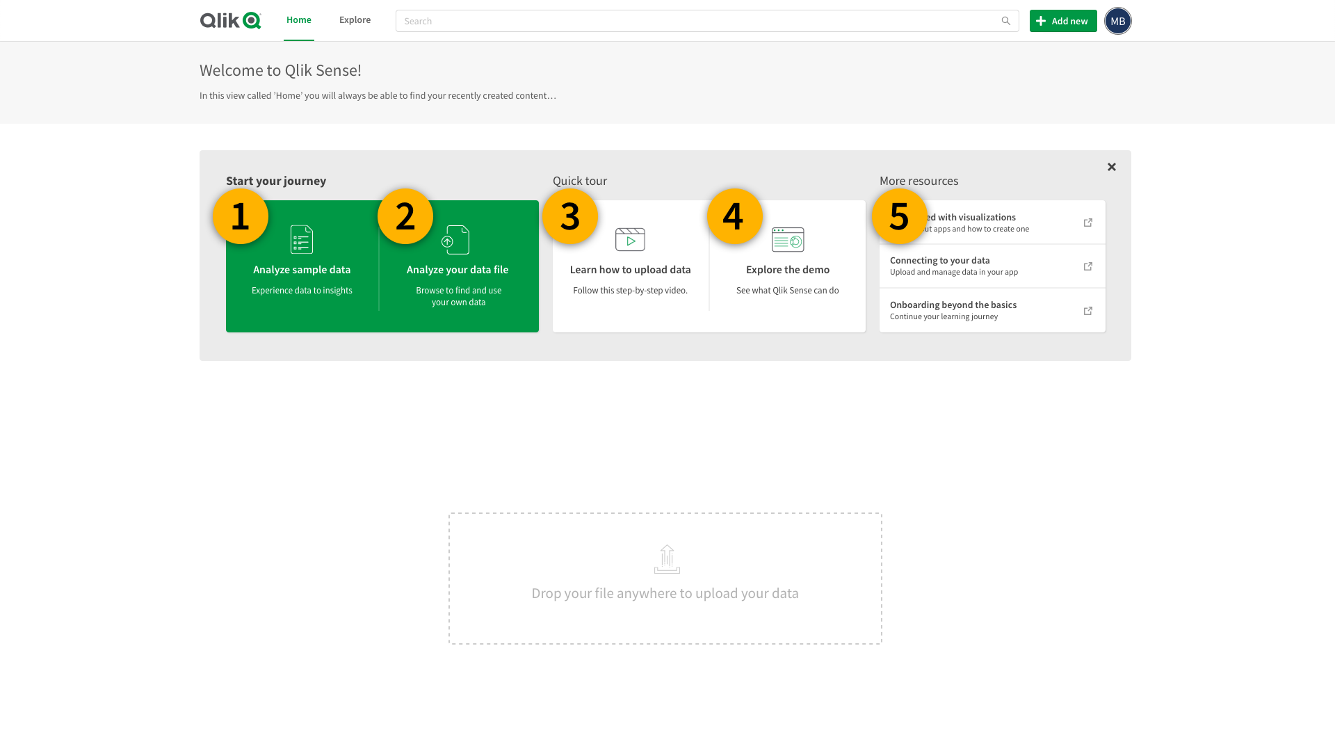
- Added sample data that our users could use to try out our product before uploading their own data
- Quick way to upload their own data and jump directly to asking questions about their data
- New tour video
- Example demo to see what's possible
- Updated resource links
What we did wrong
We narrowed the scope a little too much. We also focused on one kind of user and didn't spend enough time thinking about the other users and their first experience. We knew as we were going along that this might be an issue so we took note of it and created future improvement projects to solve these issues.
Learnings
Even though there were a few things we did wrong, I am very happy with the way this went. We tried a new way of working so that we could ideate as quickly as possible while keeping everyone involved in this project in the loop. This led to us getting an updated version of our landing page out in record time. This is the first time I've seen a project go out so quickly but still be of very high quality.
There were many challenges that we faced while this was going on. The main being that we started this project in early March of 2020, just before we went into lockdown. We went from being able to quickly jump into a room and brainstorm ideas on a whiteboard to all of our meetings being online and all of our brainstorms happening through Zoom and Miro.
We launched this at the perfect time: we needed a big improvement to make our product shine so that we could continue to retain and attract new customers during the roughest patch of the pandemic.
Results
We always knew that this area of the product needed a revamp, but the SUS score was the real kick in the butt that we needed to get this project started. It also seemed to be the best and easiest improvement to get more conversions. Everyone on the project felt very confident when the prototype that we created tested well. Our user testing team tried hard to keep our excitement low since it's very common to test really well in a prototype, but when everything goes live that SUS score could still be low. The team and I were ecstatic when we found out that not only did we beat our original goal of a SUS score of 68, we ended up testing the final working version and got a SUS score of 87.5! When we launched in May we instantly saw a huge improvement that week, which we took to be quite impressive given that most other businesses were declining or at a stand still.